Logo
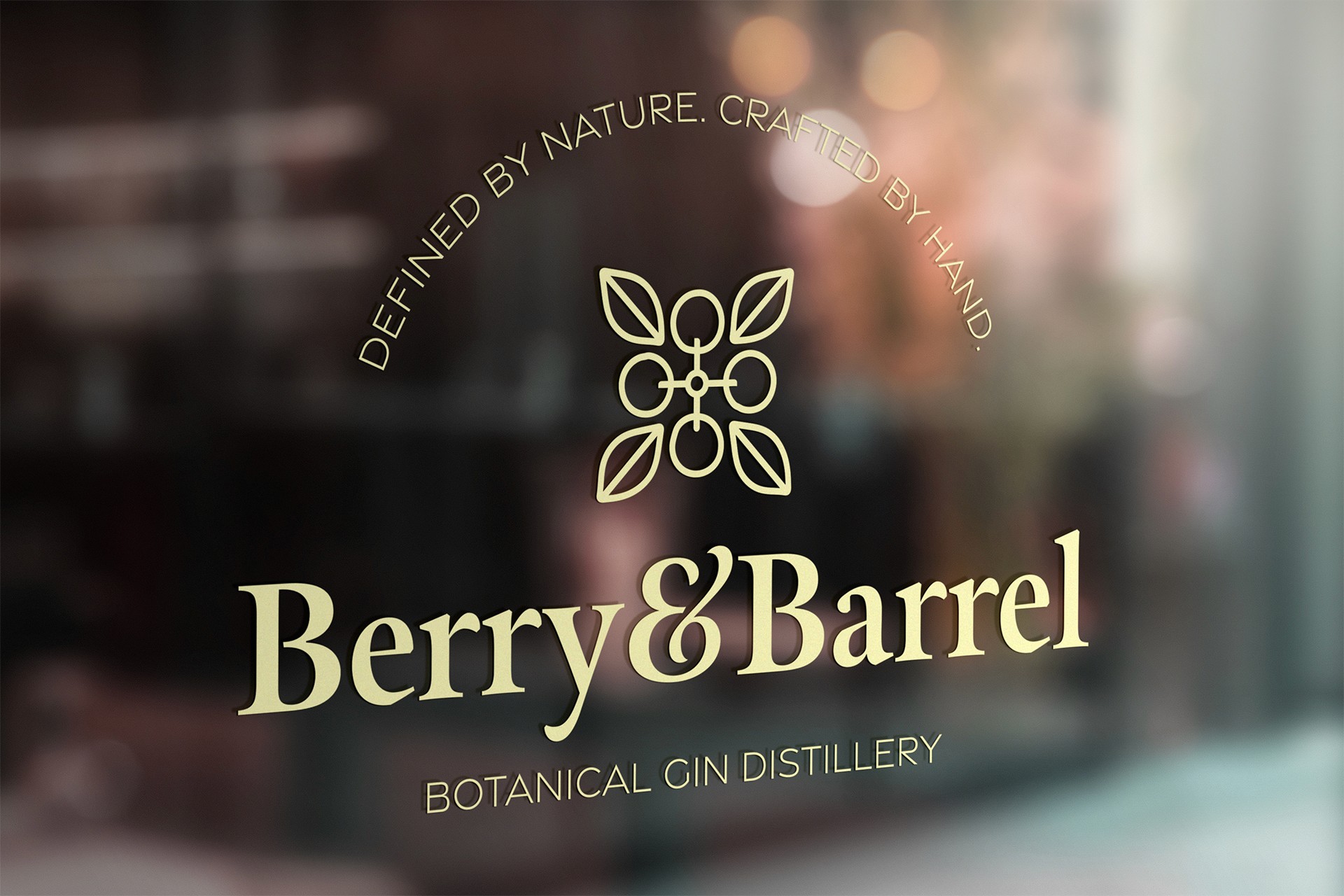
Berry & Barrel's logo
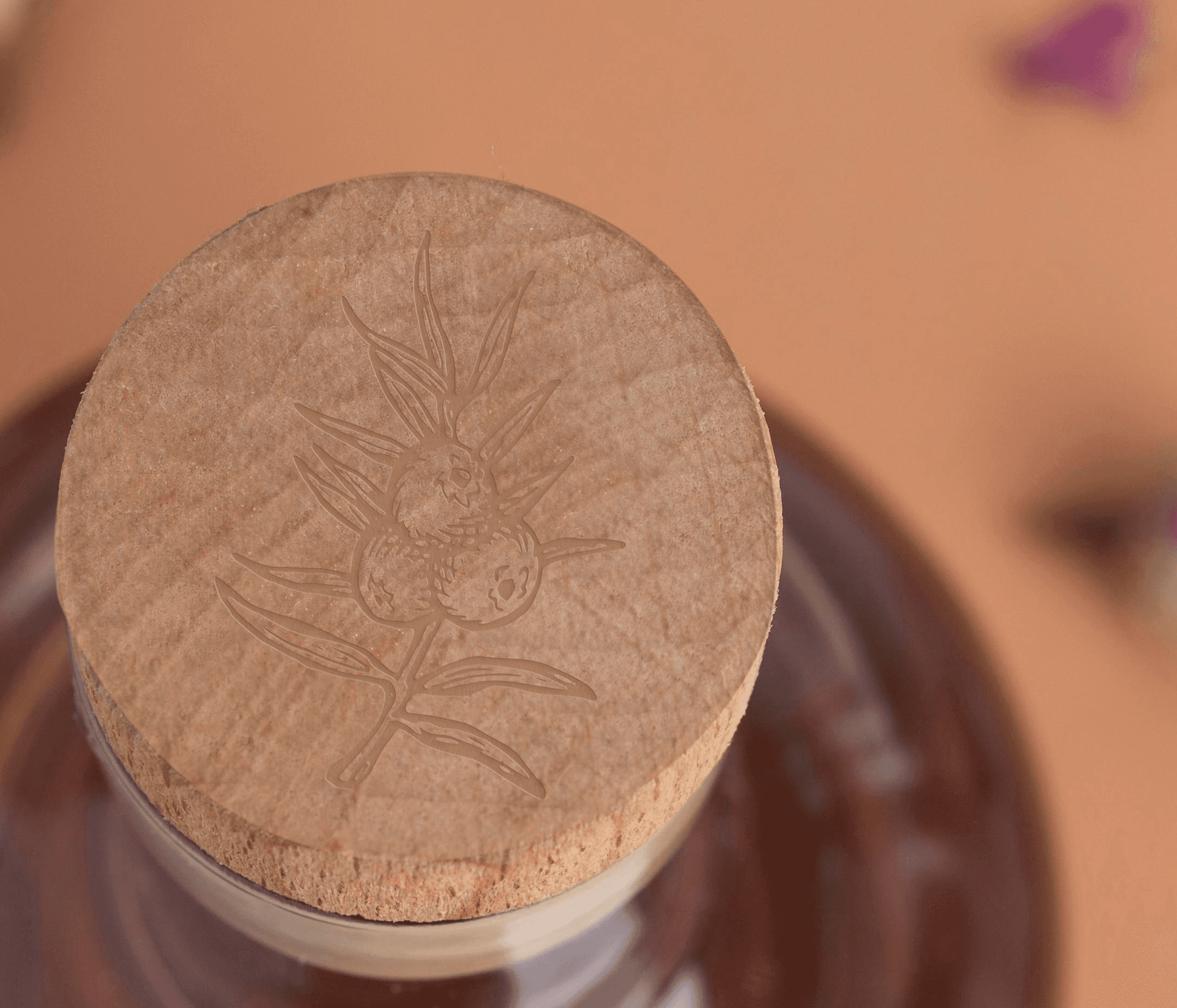
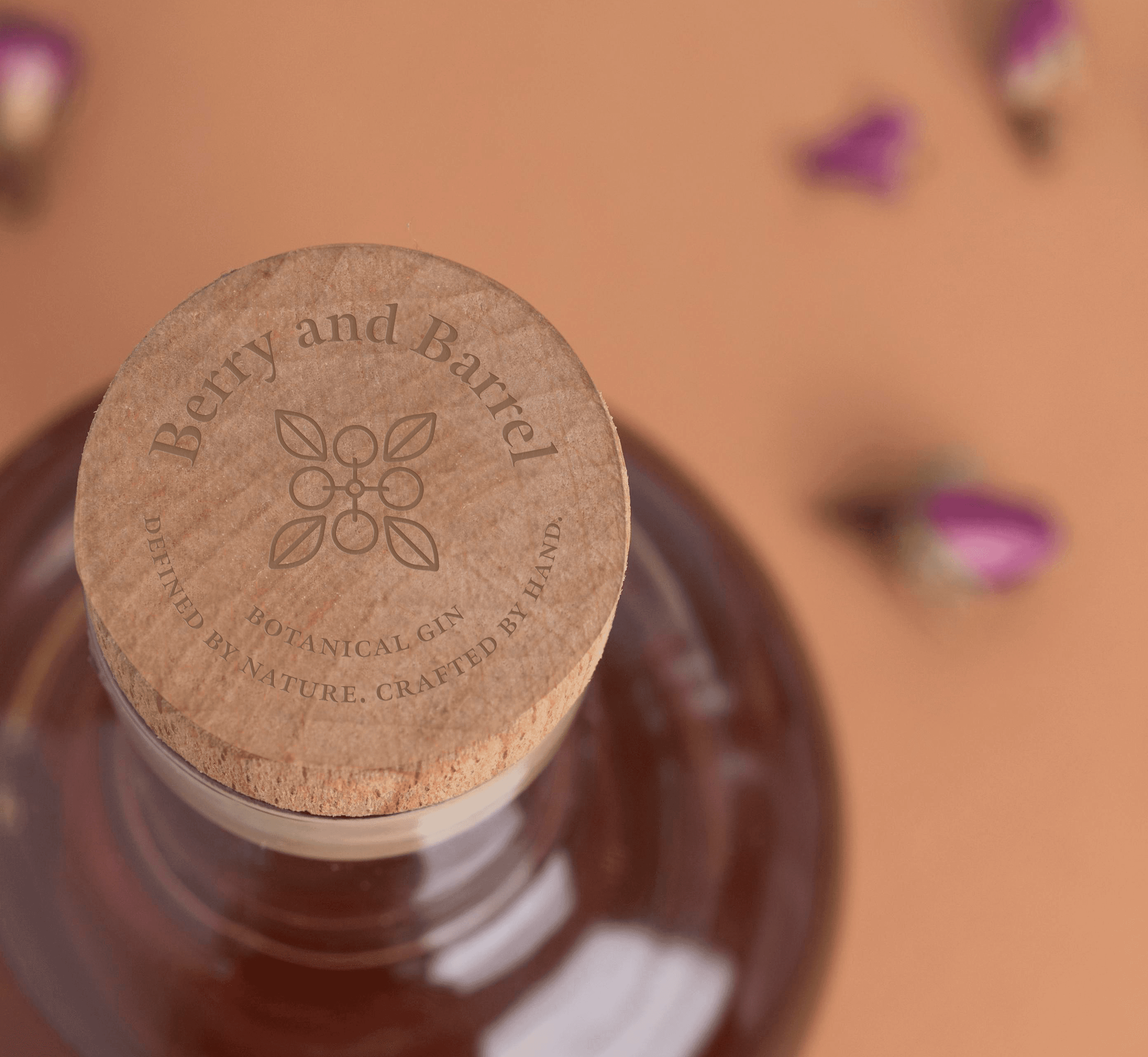
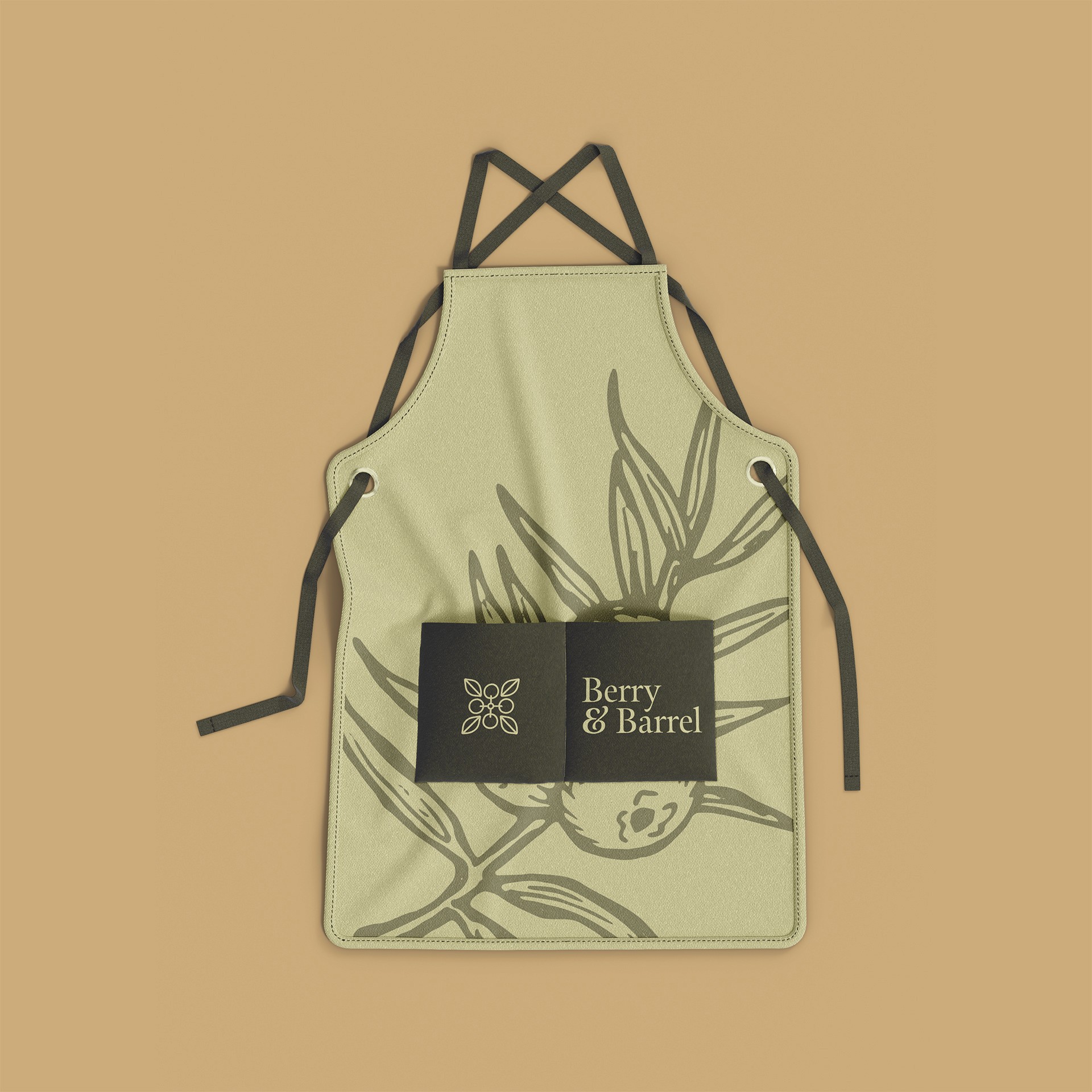
The Berry & Barrel logo strikes a balance between elegance and simplicity, making it a strong representation of the brand. The serif logotype, with its refined and timeless style, conveys the sophistication of the gin distilling process, while the exaggerated ampersand adds a memorable touch. The logo icon, a clean abstraction of berries, subtly nods to the botanical ingredients that define the product. Together, these elements create a visual identity that feels both classic and modern, perfectly capturing the essence of Berry & Barrel’s commitment to quality and nature.
Label Crafting
Standout packaging
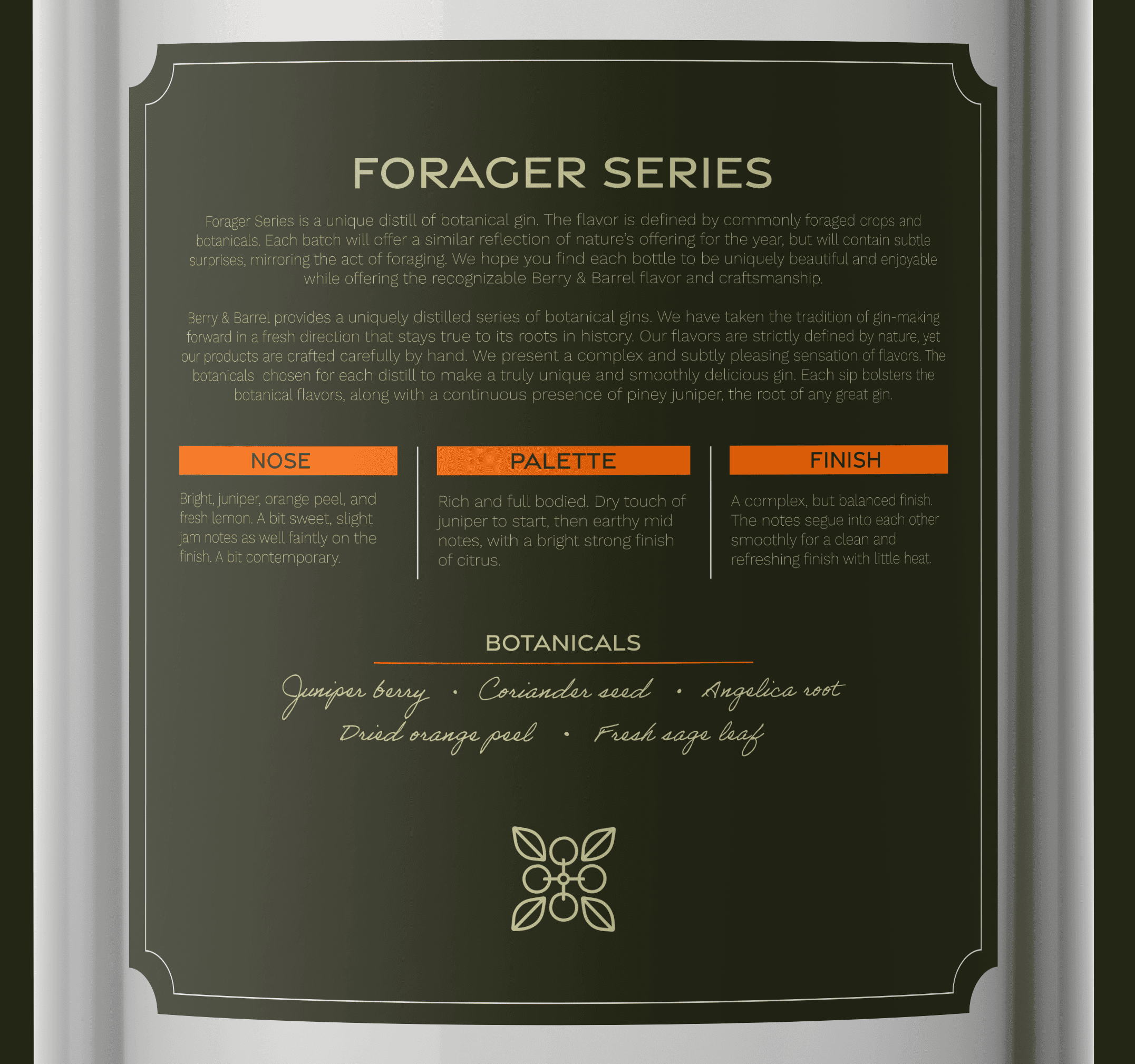
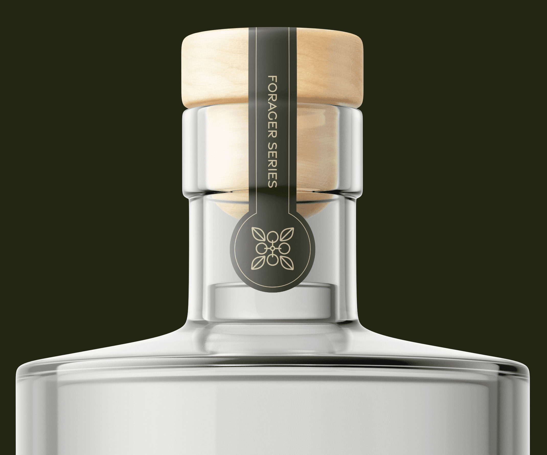
The bottle labels for Berry & Barrel blend organic illustrations and handwritten elements with a clean, structured layout, creating a captivating contrast. The gentle, free-flowing illustrations evoke the natural and botanical origins of the gin and provide texture and depth to the background. Meanwhile the precise, well-considered structure ensures a polished and cohesive appearance. The balance the between spontaneity of the handwritten elements and the carefully structured order not only grabs attention but also reinforces the brand's core values—celebrating nature’s beauty with refined craftsmanship. The result is a visually striking label system that enhances the overall brand identity while remaining authentic to Berry & Barrel's ethos.
Bar Coasters
Functionality and engagement
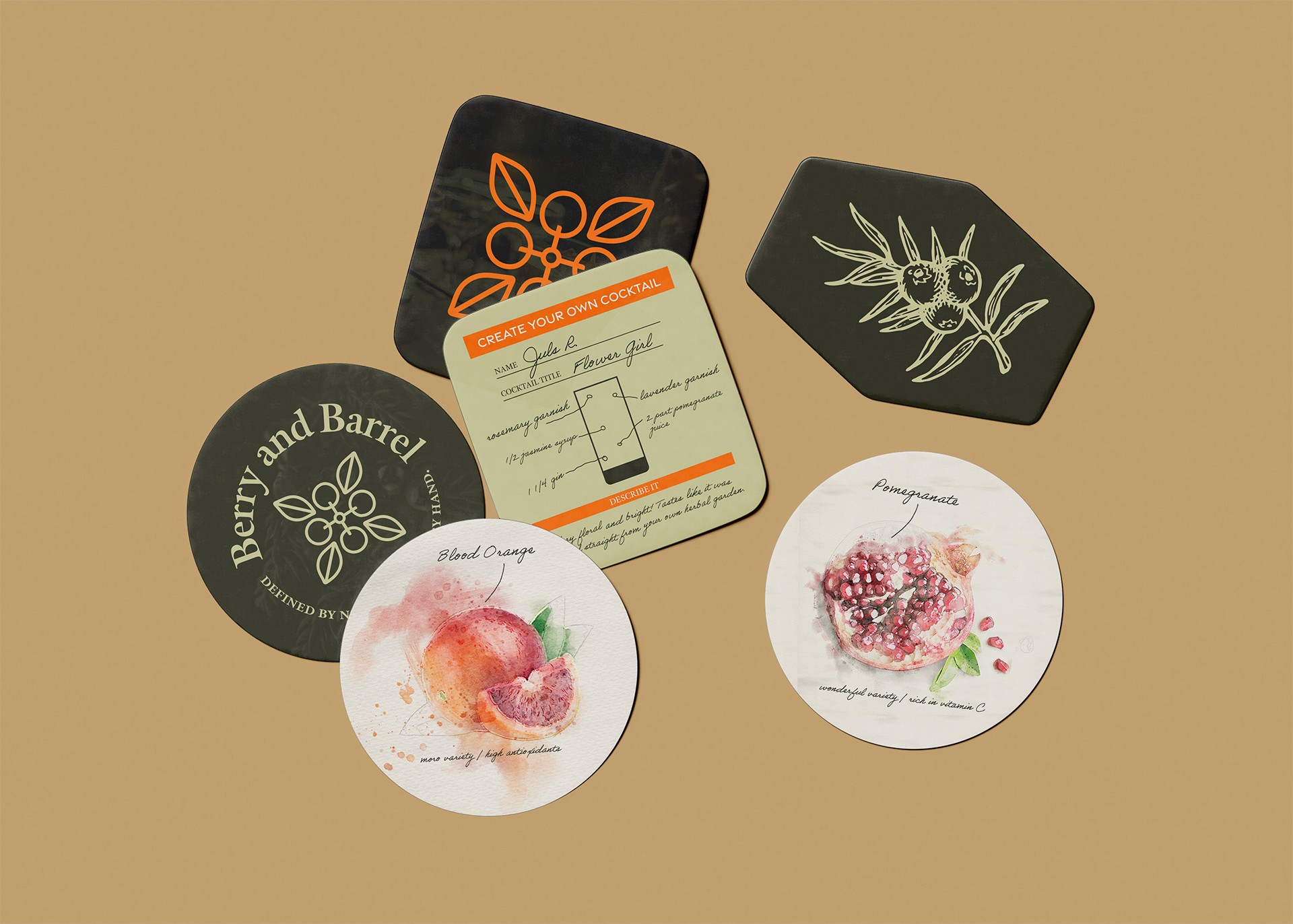
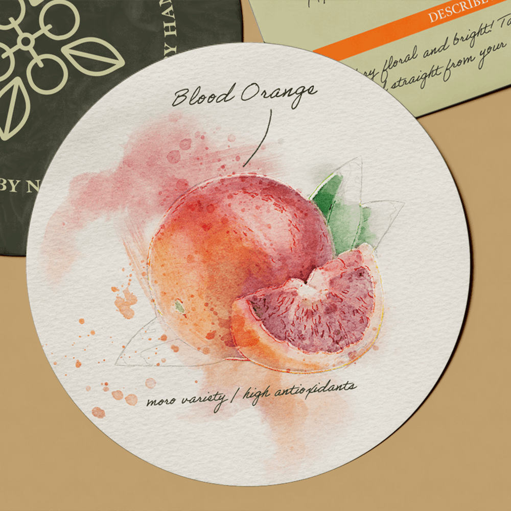
The coaster set serves as both a functional tool and a platform for audience engagement, seamlessly blending the brand's values with an interactive experience. More than just drink rests, the coasters invite customers to become part of the distillery’s story. Whether crafting their own cocktail or leaving a personal review of the gin, each guest is encouraged to leave a lasting impression for others to discover. This interactive element fosters a sense of community and connection, embodying Berry & Barrel’s vision of creating not just a product, but an immersive experience where everyone contributes to the brand’s ongoing narrative.
Web
Bringing the brand online
The Berry & Barrel website reflects the same design principles as its packaging - combining a clean, modern interface with sleek animations for an immersive user experience. The layout allows the brand’s story and products to shine, while the subtle motion effects add a layer of interactivity, drawing users deeper into the world of botanical gin. Each page of the site is thoughtfully crafted to be both visually engaging and easy to navigate, ensuring that the online experience mirrors the elegance and sophistication of Berry & Barrel’s brand identity.
Cocktail Guide
Designing for experiences
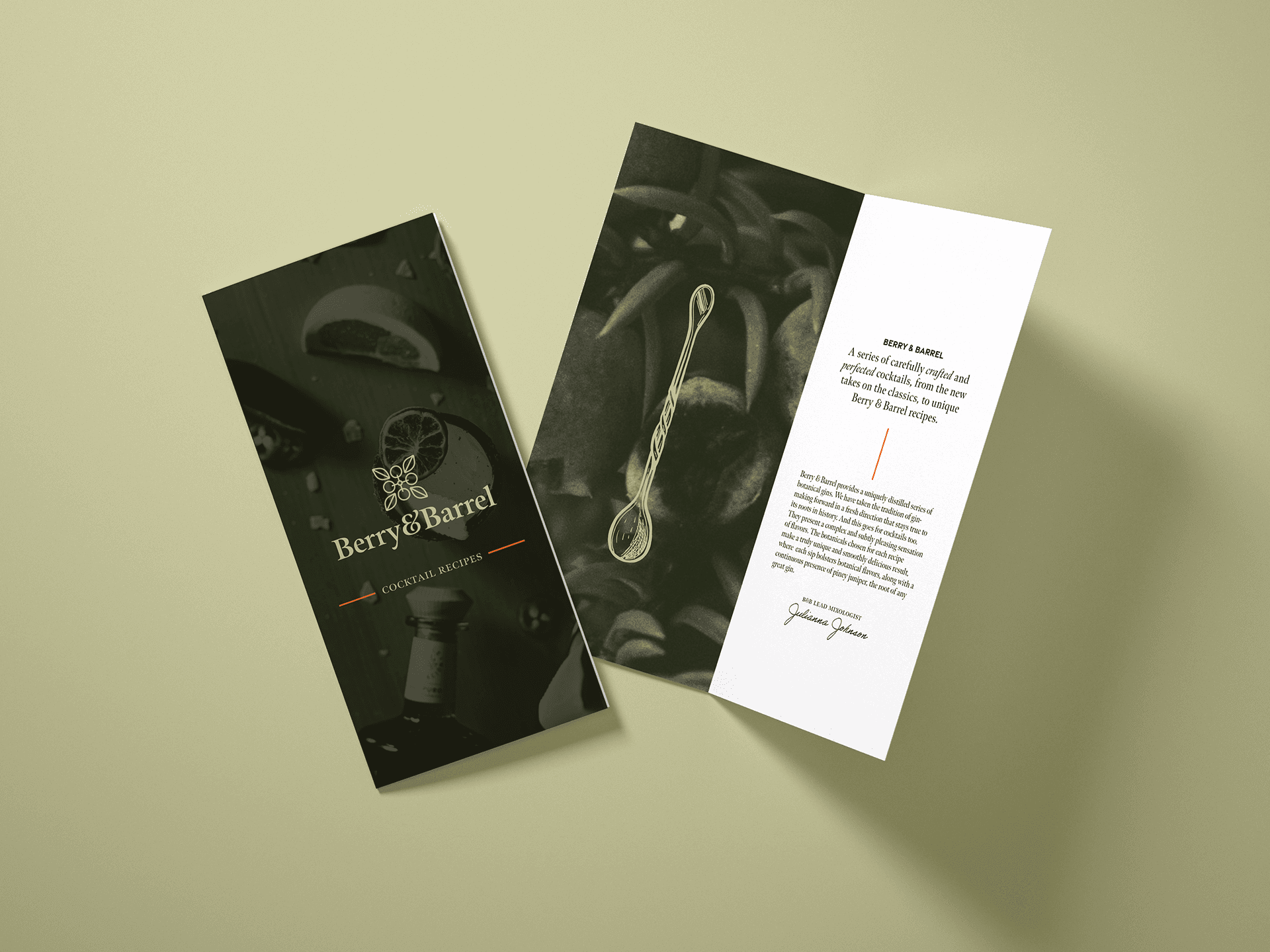
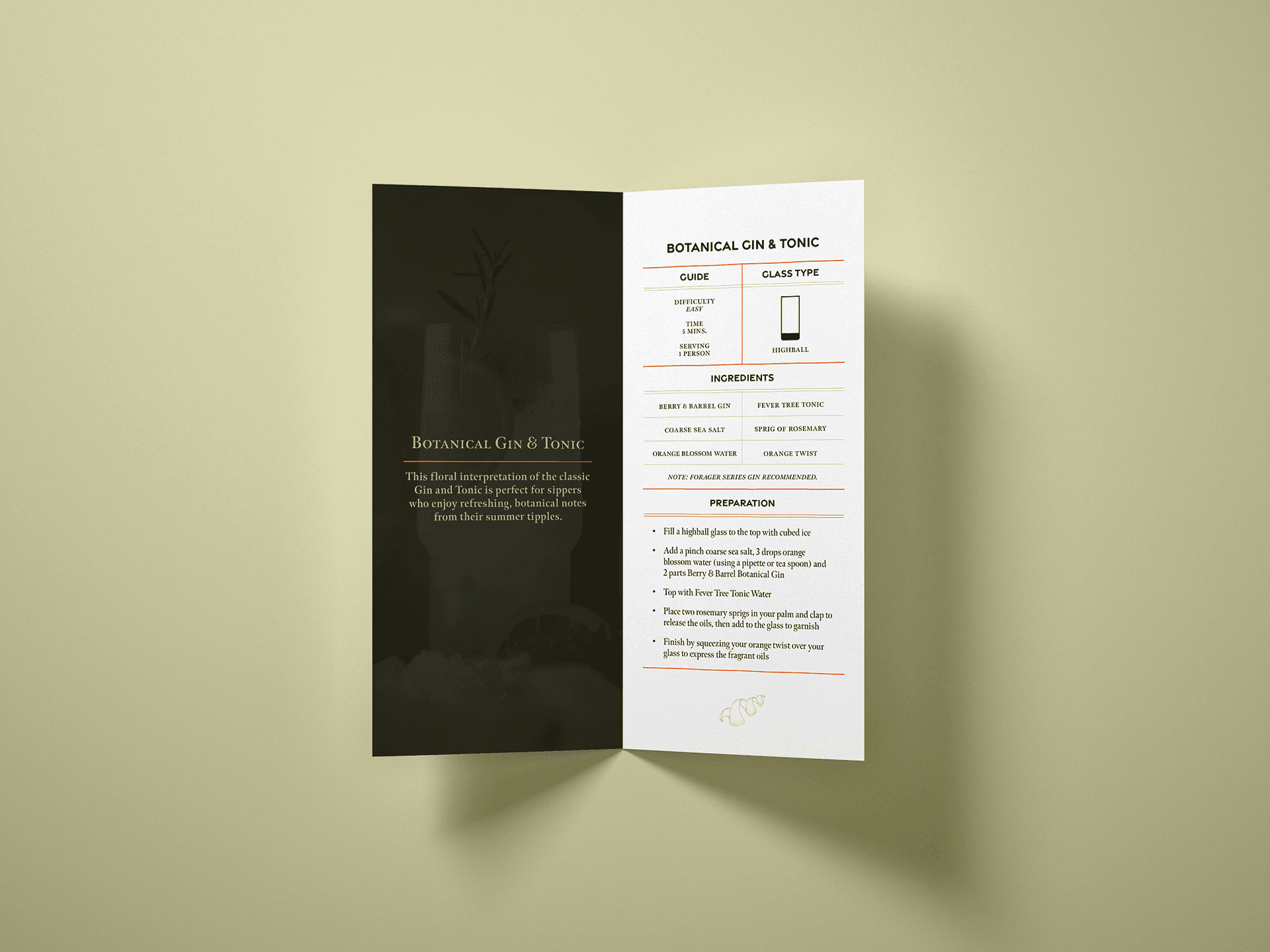
The Berry & Barrel cocktail guide combines precise typography with organic, artistic visuals, creating a uniquely engaging way to present recipes. Each page is thoughtfully organized for easy navigation, allowing users to follow instructions effortlessly. The ingredient pages feature vibrant watercolor illustrations and showcase the natural components of each cocktail, beautifully linking the consumer to the botanical origins of the gin. This harmonious blend of structure and creativity reflects the essence of Berry & Barrel, offering not just a guide but an experience that deepens the connection between the brand and its audience.


